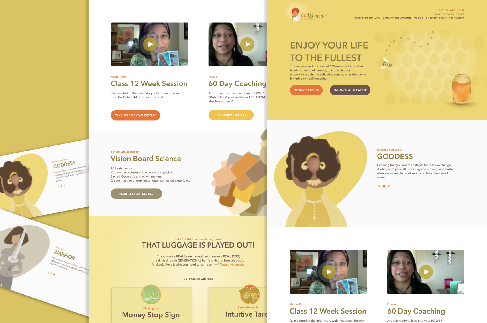
Recreating a brand

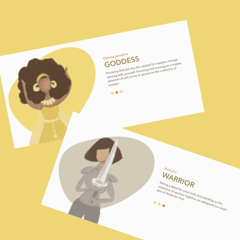
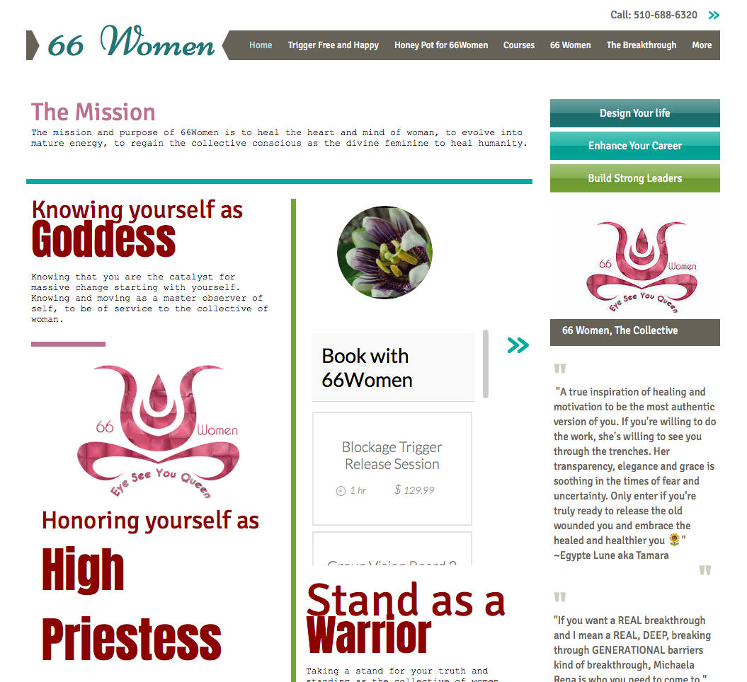
This lovely lady needed a website that represented her, her vision and what she was trying to manifest into the world.

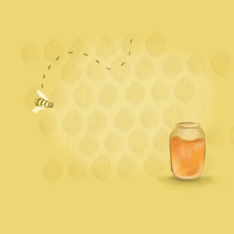
First I started with a small “mascot” that could be used on her various sites. Just a quick visual to say this was one of her offerings. She had used this photo in the past enough for it to be recognizable as Michaela Rena.

Custom Illustrations

I used custom illustrations to carry her bee theme into the site and across her social media artwork.

To organize the blocks of text she had on her home page that gave a sense of what she was all about but was disorganized I put into a slider and created “hero” like images for each set of text to match.

To give a visual punch to her best selling class I added in a heart illustration to signify her visual board session.

Brand consistency

I spared down her pallette and created a warm inviting one to tie into the bee format she had already established in her facebook group.

Pumpkin Orange

#E4763B

Chocolate

#6D5548

Beelious Yellow

#EED674

The Before

There is no way around it, her current site is in need of some love. I wanted to give her some organization, some call to actions for her users and highlight what she does so well while still staying with the honey bee theme she used throughout her material.

Buried deep in the site were her course offerings and not really a breadcrumb trail to them. Once found they left a lot to be desired visually. We moved those to the home page and changed the over all look a bit.